
Palette Scout: The Search for Salmon and Sage
Recently, a watercolorist reached out for color recommendations: she wanted to start her Limn Colors collection with a few paints that could be used for an upcoming commission. The client had shared a palette with light and dark sage greens, a beige-yellow (yeige?), and a pair of peachy, salmony tones. The target colors were a little desaturated, not quite pastel, still a bit punchy.
With a big palette, you could definitely mix two or three paints to produce each one of the five colors. But identifying a limited palette, preferably three paints, that could easily mix the color scheme was the challenge.

THE INSPIRATION
The goal was to find a few paints that could be used for an artwork that centered around these five colors.
COLOR EVALUATION
Testing began with a row of small swatches of candidates, full-strength masstone on the top row with each water-diluted tint below.

Immediately, it was apparent that a tint of limonite could work for the third color as-is. Terra verte was pretty close too and would be good for desaturating brighter colors, but wasn’t yellow enough to give the orange needed.
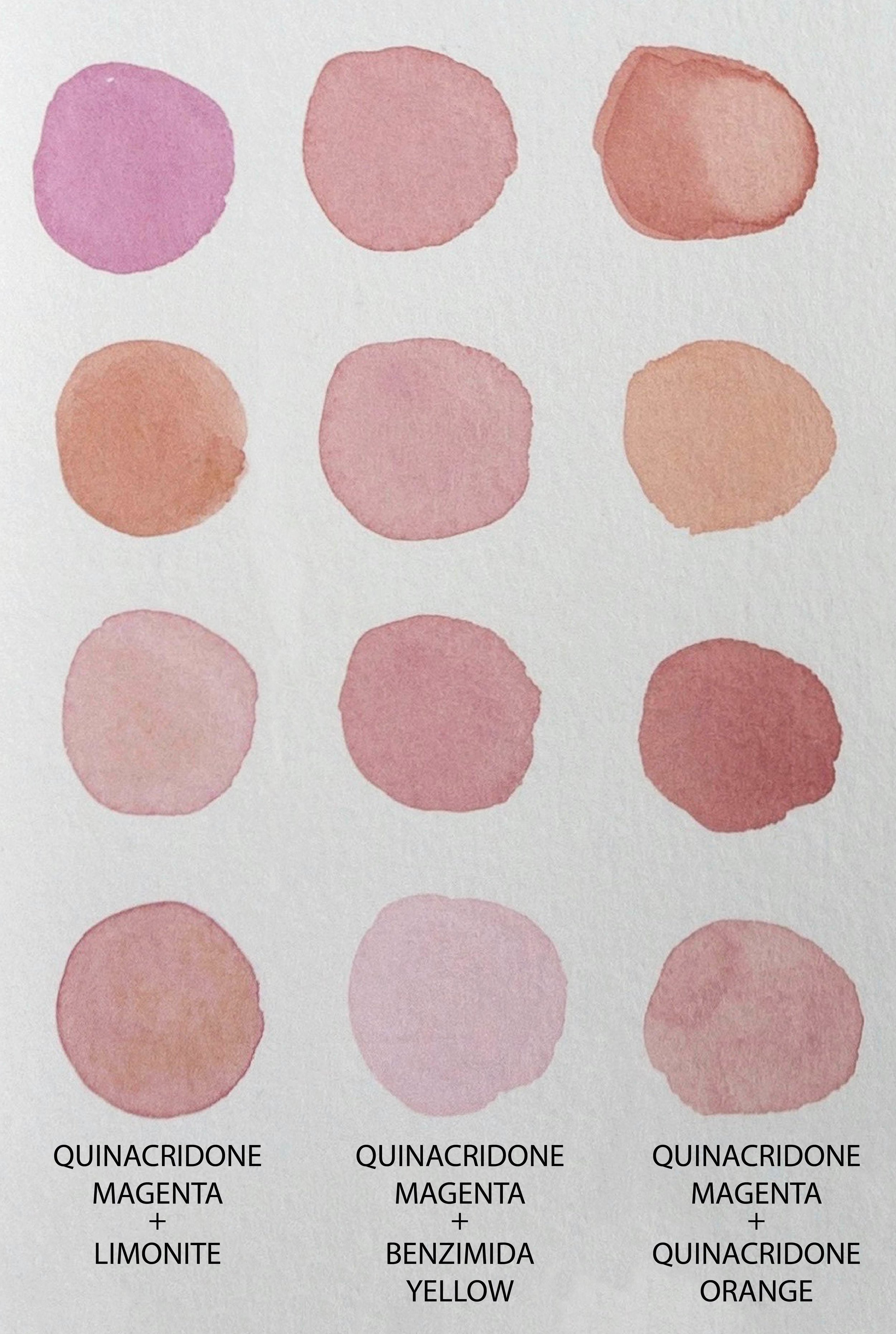
Quinacridone magenta was a perfect base for the creamsicle and guava hues. Mixing it with limonite, benzimida yellow, and quinacridone orange all worked for the warmer end of the spectrum, though bright benzimida was a tad too vivid.
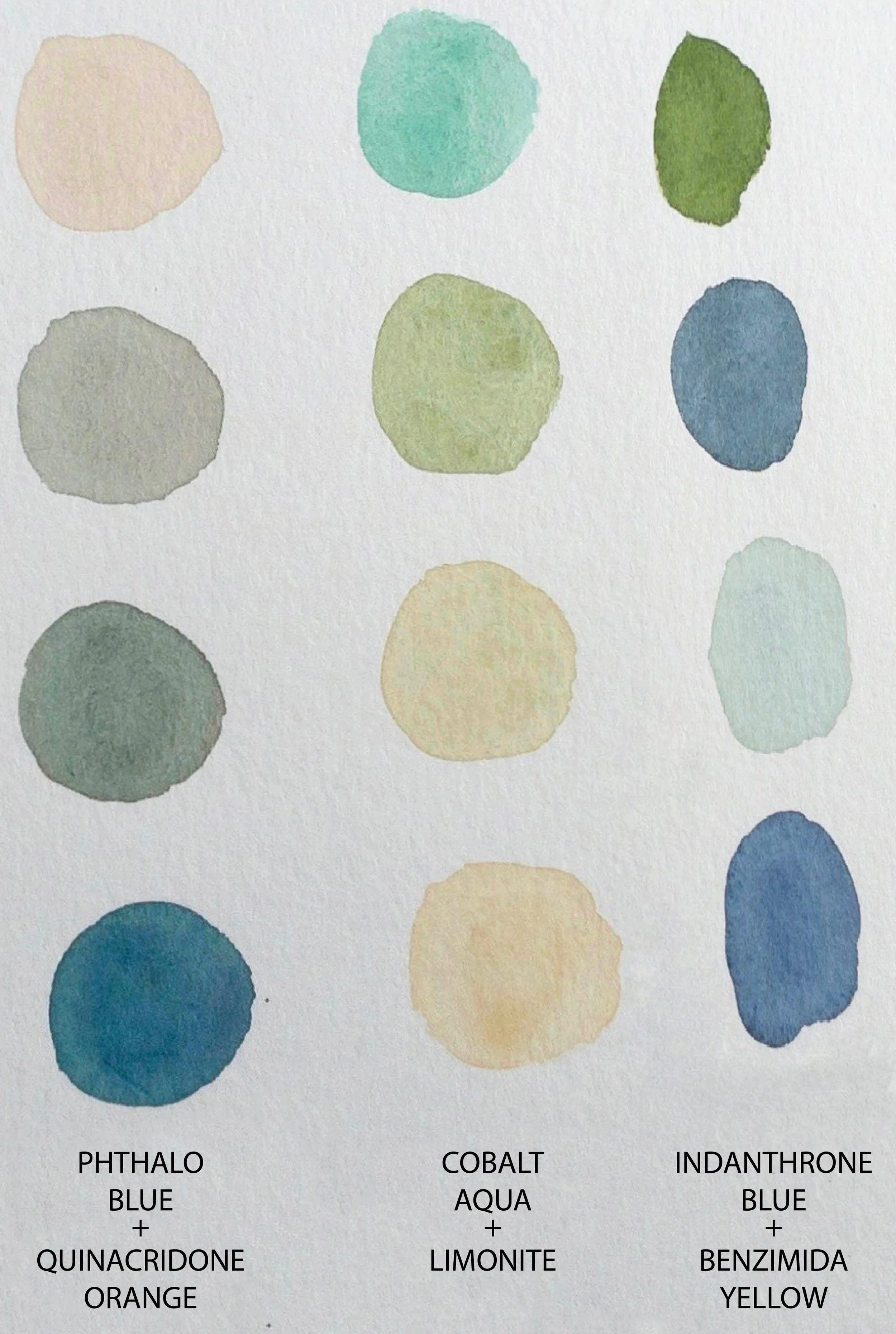
The next step was to find ideal combinations for the greens. Phthalo blue is a go-to paint for mixing greens, but duller, darker indanthrone blue had potential for these particular shades of green, as did cobalt aqua if it was mixed with an earthier yellow. At any rate, these greens called for using complementary colors or an already muted color.
The surprise in the experimenting came from the lovely, dark teal that phthalo blue and quinacridone orange generated. Adding water brought it close enough to the lighter green to require only minor tweaking. Taking the lighter green and adding more water and a touch of quinacridone orange made the yeige.

The final palette recommendation was phthalo blue, quinacridone magenta, and quinacridone orange.
DARK GREEN: more phthalo blue + less quinacridone orange, in masstone
LIGHT GREEN: more phthalo blue + less quinacridone orange, diluted with water
YEIGE: more quinacridone orange + less phthalo blue, very diluted
ORANGE: more quinacridone orange + less quinacridone magneta, a little diluted
PINK: more quinacridone magenta + less quinacridone orange, a little diluted
WHY IT WORKS
All three happen to share several properties—transparent, micronized synthetic pigments, lightfast, high tinting strength, staining—that make them natural mixing buddies. That particular set of shared attributes also helps keep those greens clear and unmuddied even though they are made with complementary colors.
Not only did these three colors work well for the client’s palette, they were also a great match for that painter’s beautiful, brightly-colored art.

SHOW YOUR WORK
If you tried creating this palette, let us know which pigments you chose and how it turned out! Here are two ways to share your mixes:
Leave a comment and a photo on the Facebook post
Tag #LimnColors and #PaletteScout on your Instagram post or comment on our Instagram